@cnnbrk ain’t CNN, but with >30K followers, he owns the brand

TechCrunch posted about CNN’s twitterings the other day: Apparently, the feed’s followers were upset about a tweet that spoiled their Olympic viewing experience by revealing golden boy Michael Phelps’ latest feat shortly after he kicked the aquatic asses of the world’s other really freakin’ fantastic swimmers.

But it wasn’t CNN that tweeted. It was cnnbrk, a bot written by news junkie James Cox that simply rebroadcasts CNN’s breaking news email alerts.

cnnbrk on Twitter

Twitter is the perfect medium for a news organization like CNN — they’re the first place you turn to see what’s going on, right now. cnnbrk has gathered 31,502 followers delivering that immediacy on the the most ADD site online, Twitter. CNN’s official feeds lag far behind: their cnn, CNN_Newsroom, cnni, politicalticker, and cnnireport have just over 8,400 followers, combined. (I’m pretty sure these are all maintained by folks at CNN — it’s kind of hard to tell.)

This *isn’t* CNN

The Guardian wrote about the brand confusion a couple of weeks ago, check out what Cox had to say:

“I do indeed wield the power of their brand: if I posted right now that Bush is due to be impeached, or that Diet Coke really still contained cocaine – I think the repercussions would be unpleasant. So I’ve been walking a fine line, ensuring that I keep somewhat under the radar, whilst also wishing that it would become even more popular.”

Cox isn’t pretending to be CNN, but the Olympic boondoggle did result in angry tweets directed toward CNN, and TechCrunch reported that CNN was the spoiler source — since then some twitterers have figured out that cnnbrk is not CNN, and TC has corrected the story.

I doubt that Cox will be able to keep this up if CNN decides to drop the hammer — I’m no expert but it seems like his use of the CNN name miiight be against the rules. (cnn follows cnnbrk, so Cox isn’t flying very far below the radar.)

Huffington Post launches first local site: Chicago braces for celebri-blogging

Chicago’s got several online news sources: The Windy Citizen, Chi-Town Daily News, and Gapers Block, are all excellent and locally owned. And we’ve got network blogs like Chicagoist bringing the snark, but is the city that works ready for Moby?

It had better be, because here come the pretty people: The Huffington Post has invaded Chicago.

Huffington Post Chicago

From Phil Rosenthal’s coverage in this morning’s Tribune:

“I just got a great blog post from John Cusack,” Huffington said. “People who are from Chicago have all these amazing warm feeling and memories of Chicago. … It is tribal. John is in Bangkok making a movie, and he was kind of emotional with this ode to Chicago.”

The local sites have been working the HuffPo model for a while now: topical blogs, original news coverage and lots of links to the mainstream news sources with good news and shitty websites. Can Chicago sustain another?

Good and bad news

The good news is that all the local web sites (of which the HuffPo has an exhaustive list at the end of their home page) ought to see a lot more traffic with a high-profile site like the HuffPo linking to them. A rising tide and all that. Everyone gets more ad revenue. Woo, woo!

Ths bad is that the little guys like Windy Citizen are succeeding because the Sun-Times and Tribune suck at the web. If the HuffPo gets all the online readers and stops linking to the other web outlets, then it’s game over for local online news.

Or maybe they’ll hire the sacked Trib alums, buy the tower, and run the papers outta town.

Disclosure: I write a blog at The Windy Citizen, and occasionally give them a hand with nerdy things.

Dearest journalists, stop being jerks: Why not publish the data too?

My comrade in arms Ryan Mark sez:

The Sun-Times published the names, salaries and positions of 145,000 Illinois, Cook County, and Chicago employees on their website this weekend. The names and salaries are online in the form of a simple searchable database.

But the data is buried. There’s no way to get to a spreadsheet of this information. On paper there are physical limitations to publishing your data, but online, you’re unlimited. Why not just post the file? Ryan is spot-on:

I want a link to download a csv file. I want to plug it into Many Eyes. I want to run my own reports on it.

If I had to pick the one craziest thing about journalism, it’s this. We closely guard our sources, even from our colleagues at the same organization. We make FOIAs and file them away. And now that we’re online, we don’t link to our source materials, we don’t publish our data, and we’d never, ever link to another news source for background. WTF!?

Centre Georges Pompidou, by Thomas Claveirole

We demand transparency and act with opacity

Forgive the n00b if I’m wrong, but from what I gather this attitude is the result of years of fierce competition between (and within) news organizations — we’re trying to scoop the cross town gazette.

Well, quit it!

Journalism needs an attitude adjustment. The house is burning! The ship is sinking! The, um, battlestar is circling the event horizon! Pick your metaphor — the deal is, we’re all in this together. Start playing nice, for chrissakes.

We’re here to help our readers better self-govern, and we’re failing them, because we’re being competitive assholes. And maybe — just maybe — if we give them a proper web experience, they’ll go to us instead of Google and we’ll make a buck too.

Froot loops, search addicits, and augmented reality

Quote of the day goes to David Coen: “I wish I could just “command-F” for C.T.C (Cinnamon Toast Crunch).”

Amen! My pinky finger twitches for the “/” key (old-school Firefox shortcut) all the time: when I’m scanning ingredients, reading a news story, and finding my location on a map.

After a taste of what the web can do, I’m hooked. I need it all the time.

cereal aisle, by Ben McLeod

More from Señor Coen:

If you wanted to know what happened in the world you either turned on the TV or checked the headlines in your morning newspaper. Google has them beat. It’s too late to try and become the aisle sign (the first thing people go to). But there is still room to become the helpful employee roaming the aisle. That’s where news organizations can still make their mark.

So, paper is out, and journalists will become be the online guides. Boing Boing does this remarkably well. They post the stories that matter to me, and a whole lot of people like me. (Who knew copyleft, unicorns, and cryptozoology could command such an audience?)

But we’re still trapped in our computers

Find as you type makes the web livable. But off-screen search, now that would make reality livable. Epiphany, the just-barely-science-fiction augmented reality device from Vernor Vinge’s excellent book Rainbows End, gives the wearer queryable visual (and haptic) overlays of the real world:

If you override the defaults you can see in any direction you want. You can qualify default requests — like to make a query about something in an overlay. You can blend video from multiple viewpoints so you can ‘be’ where there is no physical viewpoint. That’s called ghosting. If you’re really slick, you can run simulations in real time and use the results as physical advice. That’s how the Radners do so well in baseball.

This is the sort of stuff journalists need to be geeked about. If we’re to be the sensemakers, as David’s post implies, we can’t let ourselves get stuck in the narrative tar pits.

We must create new ways to make sense of the world.

(I’ll happily host the first meeting of the sci-fi for journalists book club. Who’s bringing the chips?)

Thinking about data visualization for journalists

I posted the other day about data visualization tools, but even the best tools can’t save you if you’re clueless about visualization techniques. Most of this stuff isn’t web-specific, but I rant so frequently about this stuff to my classmates that I thought it’d be worthy of a post.

Charts!

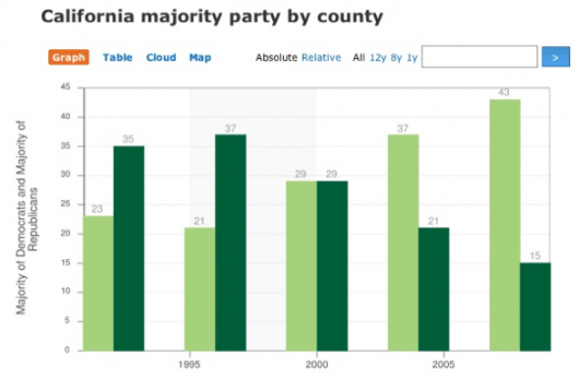
Flowing Data recently challenged their readers to improve this chart:

A bad chart

What was the graph trying to show? It was trying to show party registration in California over the past five presidential elections. Did it succeed? No. It failed miserably; however, you did much better. Here are all the reworks.

My favorite rework tells the story far better:

A good chart

More charts

The Gettysburg Powerpoint Presentation is absolutely priceless (quote from Norvig’s “making of” page):

I imagined what Abe Lincoln might have done if he had used PowerPoint rather than the power of oratory at Gettysburg. (I chose the Gettysburg speech because it was shorter than, say, the Martin Luther King “I have a dream” speech, and because I had an idea for turning “four score and seven years” into a gratuitous graph.)

Organizational overview from Gettysburg Address

Cartograms!

Le monde dans les yeux d’un rédac chef (The world in the eyes of an editor in chief) illustrates how news organizations cover the world disproportionately using one of my favorite visualization techniques, cartograms.

The cartograms below show the world through the eyes of editors-in-chief, in 2007. Countries swell as they receive more media attention; others shrink as we forget them.

Cartogram of the Economist\'s news coverage

Check out Worldmapper for lots more killer cartograms like this one:

Territory size shows the proportion of the world’s adherents to Islam living there.

Cartogram of national proportions of Muslims worldwide

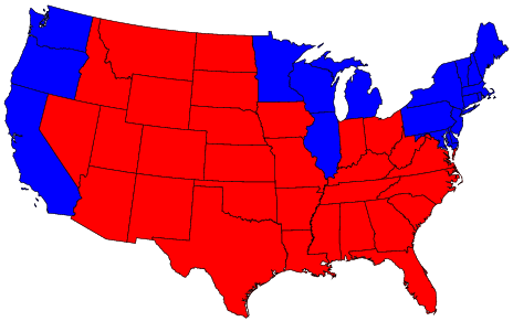
And no cartogram rant would be complete without the fantastic 2004 election race map:

The (contiguous 48) states of the country are colored red or blue to indicate whether a majority of their voters voted for the Republican candidate (George W. Bush) or the Democratic candidate (John F. Kerry) respectively. The map gives the superficial impression that the “red states” dominate the country, since they cover far more area than the blue ones.

Red and Blue states

In this map, it appears that only a rather small area is taken up by true red counties, the rest being mostly shades of purple with patches of blue in the urban areas.

Purple counties

Further reading

If you’re digging this, and you’re not yet familiar with Edward Tufte’s work… now’s when your mind gets blown. His books, including the classic The Visual Display of Quantitative Information, are absolutely brilliant. I took one of his courses several years ago — it was mind elevating.

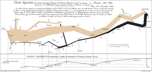
One example that Tufte uses has become, as far as I can tell, *the* visual representation of successful data visualization: Charles Minard’s graphic of Napoleon’s March. From the Wikipedia:

Charles Minard\'s graphic of Napoleon\'s March

The graph displays several variables in a single two-dimensional image:

  • the army’s location and direction, showing where units split off and rejoined
  • the declining size of the army (note e.g. the crossing of the Berezina river on the retreat)
  • the low temperatures during the retreat.

Brilliant.