Thinking about data visualization for journalists

I posted the other day about data visualization tools, but even the best tools can’t save you if you’re clueless about visualization techniques. Most of this stuff isn’t web-specific, but I rant so frequently about this stuff to my classmates that I thought it’d be worthy of a post.

Charts!

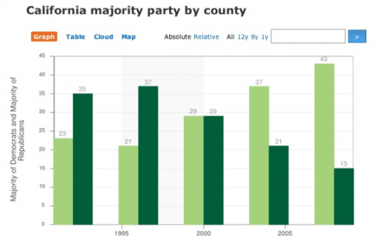
Flowing Data recently challenged their readers to improve this chart:

A bad chart

What was the graph trying to show? It was trying to show party registration in California over the past five presidential elections. Did it succeed? No. It failed miserably; however, you did much better. Here are all the reworks.

My favorite rework tells the story far better:

A good chart

More charts

The Gettysburg Powerpoint Presentation is absolutely priceless (quote from Norvig’s “making of” page):

I imagined what Abe Lincoln might have done if he had used PowerPoint rather than the power of oratory at Gettysburg. (I chose the Gettysburg speech because it was shorter than, say, the Martin Luther King “I have a dream” speech, and because I had an idea for turning “four score and seven years” into a gratuitous graph.)

Organizational overview from Gettysburg Address

Cartograms!

Le monde dans les yeux d’un rédac chef (The world in the eyes of an editor in chief) illustrates how news organizations cover the world disproportionately using one of my favorite visualization techniques, cartograms.

The cartograms below show the world through the eyes of editors-in-chief, in 2007. Countries swell as they receive more media attention; others shrink as we forget them.

Cartogram of the Economist\'s news coverage

Check out Worldmapper for lots more killer cartograms like this one:

Territory size shows the proportion of the world’s adherents to Islam living there.

Cartogram of national proportions of Muslims worldwide

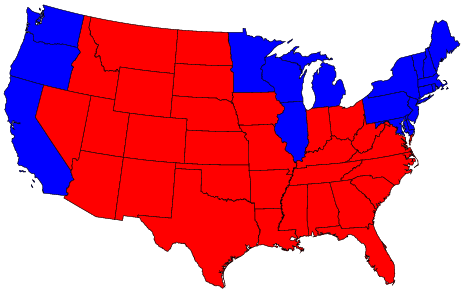
And no cartogram rant would be complete without the fantastic 2004 election race map:

The (contiguous 48) states of the country are colored red or blue to indicate whether a majority of their voters voted for the Republican candidate (George W. Bush) or the Democratic candidate (John F. Kerry) respectively. The map gives the superficial impression that the “red states” dominate the country, since they cover far more area than the blue ones.

Red and Blue states

In this map, it appears that only a rather small area is taken up by true red counties, the rest being mostly shades of purple with patches of blue in the urban areas.

Purple counties

Further reading

If you’re digging this, and you’re not yet familiar with Edward Tufte’s work… now’s when your mind gets blown. His books, including the classic The Visual Display of Quantitative Information, are absolutely brilliant. I took one of his courses several years ago — it was mind elevating.

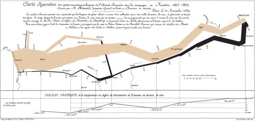
One example that Tufte uses has become, as far as I can tell, *the* visual representation of successful data visualization: Charles Minard’s graphic of Napoleon’s March. From the Wikipedia:

Charles Minard\'s graphic of Napoleon\'s March

The graph displays several variables in a single two-dimensional image:

  • the army’s location and direction, showing where units split off and rejoined
  • the declining size of the army (note e.g. the crossing of the Berezina river on the retreat)
  • the low temperatures during the retreat.

Brilliant.
Tell your story with data, without writing a line of code

I’ve been on the hunt for quick and dirty ways to show off data: visualization tools that are free, pretty, and easy to embed in a story.  Here are my finds so far.

Kick-ass embeddable visualizations

Upload your data set to ManyEyes, and you can turn it into all kinds of neat charts and wacky interactive stuff like word trees. They make it really easy to share. Click on the “share this” link below any visualization to get a snippet of HTML to paste into a story.

Amy Gahran loves word trees too:

You specify a word or phrase, and ManyEyes shows you all the different contexts in which that string appears in a tree-like branching structure. This helps reveal recurring themes in the document, and shows how topics and subtopics are related.

The other hot ManyEyes demo is the government expenses visualization. Use the menu on the left to drill down into spending categories. (Can you find the S&L bailout?)

There are so many kick-ass things you can make with ManyEyes: tree maps, tag clouds, and bubble charts, to name just a few. Here’s a map!

Timelines get sexy

It’s easy to make sweet, interactive timelines with circaVie. Like, really easy. Sign up, click “start a timeline” and add events. Like ManyEyes, they also make it simple to embed a widget, just paste in the provided snippet.

http://www.circavie.com/flash/timeline.swf
Text message scandal timeline by DFP Graphics

Words are pretty

Wordle makes pretty text visualizations by shuffling words from a file, web page, etc., and sizing the words based on how frequently they occur. Much simpler than a word tree, but sometimes simple is just what you need.

Sixth W on Wordle

Need a map, fast?

Google’s Charts API is suuuper cool.  It can make you bar charts, maps, venn diagrams, even sparklines.  But it’s a tool for web developers, so it’s a bit chewy to use if you’re not familiar with a few things.

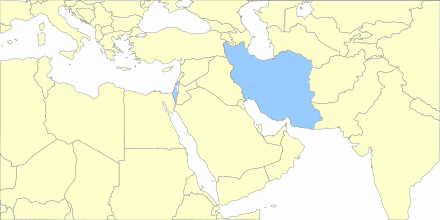
Lucky for us, lots of folks have built tools to make it easier. The Google Chart Creator is one of the better ones.  I made this map in under a minute.

Google chart map of the Middle East

What else?

It feels like I give the NYT props every day for their data viz skillz. Their stuff is pretty and awesome, but they’ve got a team of developers, designers and whiz-bang specialists.

What other tools are out there that make it simple to create embeddable news visuals, sans a staff of flash savants?

Beautiful new media storytelling

We Tell Stories is a project from Pengiun: six new stories inspired by six classics, all told using new media techniques like blogging, mapping, and infographics. – totally freakin’ neat.

Over six weeks writers… will be pushing the envelope and creating tales that take full advantage of the immediacy, connectivity and interactivity that is now possible. These stories could not have been written 200, 20 or even 2 years ago.

Ideas are travelling faster

More great reading, NYT and locative media

Google Earth, New York Times Team Up

You can now browse New York Times news based on geography. Has the New York Times become hyperlocal, even though the content may not have that perspective. if all goes according to plan, the news will be updated every 15 minutes.

The Center for Locative Media

As educators and amateur neo-geographers, we found a rich vein of place-based pedagogy to tap into. Here story was already married to place. As technologists we watched the tools become available to not only tag content to place, but to experience it in that place.

On second thought, forget Google, make your own maps

Latest news in Ravenswood on EveryBlock

Paul Smith from EveryBlock has written an excellent article on making your own interactive maps.

An ecology of open source online mapping tools has emerged alongside the market leader. It is now possible to replicate Google Maps’ functionality with open source software and produce high-quality mapping applications tailored to our design goals.

The folks over at A List Apart have this knack for publishing articles that I come back to again and again. I think this one will be another on that list.