I’ve been on the hunt for quick and dirty ways to show off data: visualization tools that are free, pretty, and easy to embed in a story. Here are my finds so far.
Kick-ass embeddable visualizations
Upload your data set to ManyEyes, and you can turn it into all kinds of neat charts and wacky interactive stuff like word trees. They make it really easy to share. Click on the “share this” link below any visualization to get a snippet of HTML to paste into a story.
Amy Gahran loves word trees too:
You specify a word or phrase, and ManyEyes shows you all the different contexts in which that string appears in a tree-like branching structure. This helps reveal recurring themes in the document, and shows how topics and subtopics are related.
The other hot ManyEyes demo is the government expenses visualization. Use the menu on the left to drill down into spending categories. (Can you find the S&L bailout?)
There are so many kick-ass things you can make with ManyEyes: tree maps, tag clouds, and bubble charts, to name just a few. Here’s a map!
Timelines get sexy
It’s easy to make sweet, interactive timelines with circaVie. Like, really easy. Sign up, click “start a timeline” and add events. Like ManyEyes, they also make it simple to embed a widget, just paste in the provided snippet.
http://www.circavie.com/flash/timeline.swf
Text message scandal timeline by DFP Graphics
Words are pretty
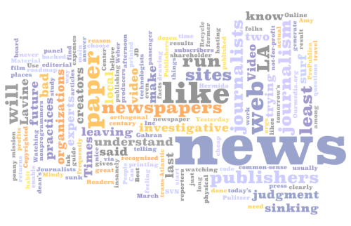
Wordle makes pretty text visualizations by shuffling words from a file, web page, etc., and sizing the words based on how frequently they occur. Much simpler than a word tree, but sometimes simple is just what you need.

Need a map, fast?
Google’s Charts API is suuuper cool. It can make you bar charts, maps, venn diagrams, even sparklines. But it’s a tool for web developers, so it’s a bit chewy to use if you’re not familiar with a few things.
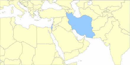
Lucky for us, lots of folks have built tools to make it easier. The Google Chart Creator is one of the better ones. I made this map in under a minute.

What else?
It feels like I give the NYT props every day for their data viz skillz. Their stuff is pretty and awesome, but they’ve got a team of developers, designers and whiz-bang specialists.
What other tools are out there that make it simple to create embeddable news visuals, sans a staff of flash savants?