Kick Ass News Apps! — projects to inspire journos

To introduce ourselves and our skills to the Trib newsroom, Joe and I showed off some news applications we love, and that we hope will inspire the journalists here to think about telling their stories in new ways online.

For the folks who missed the show, here’s a quick rundown of what we talked about. (I am sad to say that there is no way to serve refreshments through the web, so to get the full experience, you’ll have to get your own punch and pie.)

PolitiFact’s Obameter

Politifact's Obameter

Reporters and editors from the [St. Petersburg Times] fact-check statements by members of Congress, the White House, lobbyists and interest groups and rate them on our Truth-O-Meter. We’re also tracking more than 500 of Barack Obama’s campaign promises and are rating their progress on our new Obameter.

  • Brian sez: It hits the sweet spot between software and old-school reporting. Hacker journalism at its best.
  • Joe sez: Demonstrates the power of the web to provide context over time beyond each day’s story.

Tampa Bay Mug Shots

Tampa Bay Mug Shots

Our goal is to provide a complete profile for individuals booked into jail in Pinellas, Hillsborough, Manatee and Pasco counties. A complete profile on Mug Shots constitutes: name, photograph, booking ID, height, weight, age, gender, eye color, birth date, booking date and booking charge.

  • Brian sez: It’s tabloid, trashy stuff in a great-looking package. Pretty hot for a system that shows off public records.
  • Joe sez: I’m not sure how I really feel about this app, but it is a great example of making bulk data accessible to the general public.

ChangeTracker

ChangeTracker

ChangeTracker watches the White House’s web site so you don’t have to. Whenever a page on whitehouse.gov changes, we’ll let you know — via E-mail, Twitter, or RSS.

  • Brian sez: This is my project, so I’m partial, but… It’s a simple concept with many interesting uses — as both a reporting tool, and as a publishing device. Plus, it’s free and dead-easy to set up your own.
  • Joe sez: Tools like this protect us from the risk of information going down the “memory hole.”

Filibusted

Filibusted

Some senators like to filibuster and keep the majority from having their way. You might think they’re heroes. Or jackasses. Either way, they’re worth keeping track of.

  • Brian sez: It’s tightly focused site that does a great job explaining an issue that most folks don’t understand.
  • Joe sez: This one was a winner in Sunlight’s Apps for America contest. It would be easy for us to tap into the same data about legislators, bills, and votes that feed this one.

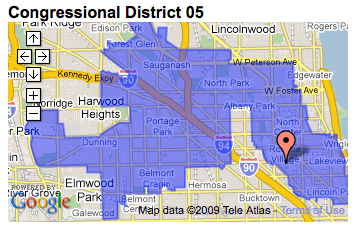
Represent and Repsheet

Repsheet

RepSheet lets you…

  • look up your elected representatives…
  • see the political zones you live in…
  • and track news about your reps.

  • Brian sez: The Times’ Represent and Windy Citizen’s loving rip-off, Repsheet, are, like Filibusted, tightly focused and explain something most folks don’t understand — in this case, the overlapping districts of representation. And they give you an easy way to follow news on what your reps are up to. Kinda hard to believe how difficult this was before, eh?
  • Joe sez: With the amount of information on the web, we need more tools like these that help people focus on what matters most to them.

Investigate your MP’s expenses

Investigate your MP's expenses

Join us in digging through the documents of MPs’ expenses to identify individual claims, or documents that you think merit further investigation. You can work through your own MP’s expenses, or just hit the button below to start reviewing.

  • Brian sez: How would *you* search through a half million pages? And the UI is wonderfully simple.
  • Joe sez: This app does a great job of keeping on the story while it’s current. Its release is an attention-grabber and can help the Guardian investigate the data even if the public’s participation is minimal or inaccurate. This Nieman Labs article provides some good lessons learned from Simon Willison, the application developer.

Many Eyes: Word tree and US Gov’t Expenses chart

Many Eyes: Word tree

Many Eyes is a bet on the power of human visual intelligence to find patterns. Our goal is to “democratize” visualization and to enable a new social kind of data analysis.

  • Brian sez: Many Eyes is a fun kit of visualization tools that are easy for anyone to populate with data and embed in a story. They’ve got maps, charts, word trees and all sorts of other neat toys to play with.
  • Joe sez: Not only are these tools a great way to provide basic data visualization, but most of them also provide readers with the ability to explore different views of the data.

Names, Lists, Photos, Stories – California’s War Dead

Names, Lists, Photos, Stories - California’s War Dead

Military deaths in Iraq and Afghanistan, 2001-Present

  • Brian sez: It’s a simple application that uses data to tell a story from many angles. If you’re a parent, maybe you want to see how many kids the soldiers had, or maybe you want to explore based on where they were from. Simple, but powerful stuff.
  • Joe sez: By collecting information about all of the dead, the Times creates a richer story center around which they can also aggregate their original coverage.

Know thy Congressman

Know thy Congressman

“KTC” is a bookmarklet that displays an abundance of political and biographical information about current members of the Senate and House of Representatives.

  • Brian sez: It’s a totally novel tool, a great use of public data, and incredibly useful. Plus, they probably coded it in a weekend. Love it in every way.
  • Joe sez: Another great example of how the web makes it so much more possible to provide background and context for stories.

Watching the Growth of Walmart Across America
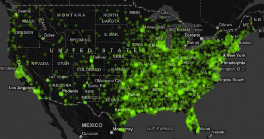
Watching the Growth of Walmart Across America

Yesterday I quickly put together my own Walmart growth video using Modest Maps. It has the usual mapping features – panning and zooming – while you watch Walmart spread like wildfire. It starts out slow with the first location in Arkansas in 1962 and then spreads vast in a hurry.

  • Brian sez: Eye candy, for sure, but damn tasty eye candy.
  • Joe sez: Visualization across space and time tells parts of the story better than words possibly could.

Feeds, tweets and APIs are the beginning. Will news orgs step up to augment reality?

In her TED talk, Unveiling the “Sixth Sense,” game-changing wearable tech, Pattie Maes demos a system that creates interactive visual layers over the real world. The actual implementation, a tiny projector tied to a wearable computer that watches your fingers for input (using colored marker caps to identify fingertips!) is cheap, but not something you’d likely want to wear to the store.

But imagine for a moment a similar system, one that detects more subtle gestures and does not physically project light onto the objects you’re manipulating. A device that annotates the real world and presents information about the person in front of you, the product you’re considering purchasing or the comparitive likelihood of catching a cab at this corner or the next block over.

Map for driving by eszter
Map for driving by eszter, based on MacGyver Tip: Heads up display with a reversed paper map from LifeHacker.

I’ve blogged about this before, but Maes’ talk reminded me how important this technology will be. It *will* happen, and although there’s much work left to do in the end user interface (Rainbow’s End by Vernor Vinge, and Counting Heads by David Marusek present brilliant visions of how they might work) the inputs to these systems are coming online today.

Feeds, tweets and APIs aren’t just for the web

Twitter, when paired with TweetDeck gives me an always-on, ambient awareness of events worldwide. Its like a tiny, quiet news radio, feeding me timely information on events I care about. When I’m at my desk, I can hear the Internet hum. Soon, that spatial restriction will be lifted.

I already use Amazon from my phone’s web browser when I’m shopping, but the APIs are there to build new, better interfaces, that, as the Maes’ demos in her talk, can port Amazon ratings and everything else into the real world.

The NYT’s and The Guardian’s new APIs are similarly useful, but present even richer information. Detailed, expert analysis of not just products, but news and events. (And surely Bittman’s recipe for Roast Chicken With Cumin, Honey and Orange would be handy to have on a heads-up display, at the grocery store, when cooking, and when you’re regaling friends with the elegant simplicity of roasting a whole bird.)

Who’s building the future?

Of the 1180 APIs cataloged at ProgrammableWeb, only 18 are categorized as “news”. If news orgs want to hang on to their last shred of credibility as the essential information providers of the last century, they’d best get on it.

APIs are the future of information, and the content creators who adopt them will augment our reality.

NYT’s new Visualization Lab: They bring the data, you mix the charts

As announced on their excellent Open blog, the Times rolled out a neat tool yesterday:

The New York Times Visualization Lab… allows readers to create compelling interactive charts, graphs, maps and other types of graphical presentations from data made available by Times editors. NYTimes.com readers can comment on the visualizations, share them with others in the form of widgets and images, and create topic hubs where people can collect visualizations and discuss specific subjects.

It’s based on the technology developed by the folks at Many Eyes (about which I’ve blogged before). In this implementation you can’t upload your own data. Instead, the data you’re able visualize is provided by the Times editors.

Still learning a bit

The interface is pretty cludgy, and the initial data sets don’t quite work with the canned visualizations (NYT folks: if you’re watching, see below for my bug report), but they should be able to work that stuff out.

England and Wales

My other complaint is that the data is more like what I’d look for in an atlas than I’d expect from a newspaper. Party Affiliation By Religious Tradition, National League HR per AB Leaders 2006-2008, and Sarah Palin’s Speech at the RNC are fun as a start, but don’t realize the potential of this system.

I sure hope data sets discovered while researching New York Times stories get uploaded to the lab. They’ve got to have some FOIAed federal data on their desktops. That kind of stuff is begging for citizen journalism.

Or, do it yourself

If you love this, you’ll want to take a swing at making your own charts over at the full-featured Many Eyes site. I’ve been playing with the Illinois State Board of Education’s schools report card data:

(The Times did make one huge improvement… their embedded charts have a *way* better color scheme.)

Nathan at FlowingData weighted in on the Lab last night:

I said the API was a good step forward. The Visualization Lab is more than a step. … I’m looking forward to seeing how well Times readers take to this new way of interacting.

Agreed. I’m really excited about this. It ain’t perfect, but it’s an exciting development for online news, especially if they start uploading lots of source materials and make it a bit easier to use. The big question is: Will people use it?

NYT releases Campaign Finance API

As announced on Open, NYT’s open source blog:

The upcoming presidential election has seen record fund-raising by the candidates and a host of new donors. Now we want our users to be able to analyze and reuse some of the data we’ve been looking at while reporting on the campaign.

Read Write Web’s take is on:

One thing that big media still does have a particularly good share of, though, is information processing resources and archival content. The Times’ campaign contribution API is a good example of this. The newspaper is far better prepared to organize that raw information, and perhaps offer complimentary content, than any individual blogger or small news publisher. …

When developers create applications that use their data, the Times will once again assert itself as an essential part of our information landscape – both in mind share and in inbound links/Search Engine Optimization for their online content.

Outstanding.

NYT to release open-source “document viewer” for investigative journalism

To help create their fantastic piece about Hillary Clinton’s White House schedules, the NYT developed a tool to aid them in analysis of the enormous amount of information that the schedules contained.

Today at the Online News Association conference, Aron Pilhofer, editor of interactive news tech at the NYT, told a session audience that they are planning to release this tool as an open-source project!

(He said it’ll be on Amazon EC2, though I’m not sure exactly what that’ll amount to.)

Details are slim, but this seems like a pretty cool thing. Pilhofer didn’t give a timeline on this project, or on their previously-announced news API, but both are on the way.

I’m guessing it’ll be after the election. They’re probably pretty busy creating all those kick-ass visualizations.

UPDATE: Be sure to check Aron’s comment below. It will be open source, but they’ll also deploy it to EC2 for folks to use instantly.