Feeds, tweets and APIs are the beginning. Will news orgs step up to augment reality?

In her TED talk, Unveiling the “Sixth Sense,” game-changing wearable tech, Pattie Maes demos a system that creates interactive visual layers over the real world. The actual implementation, a tiny projector tied to a wearable computer that watches your fingers for input (using colored marker caps to identify fingertips!) is cheap, but not something you’d likely want to wear to the store.

But imagine for a moment a similar system, one that detects more subtle gestures and does not physically project light onto the objects you’re manipulating. A device that annotates the real world and presents information about the person in front of you, the product you’re considering purchasing or the comparitive likelihood of catching a cab at this corner or the next block over.

Map for driving by eszter
Map for driving by eszter, based on MacGyver Tip: Heads up display with a reversed paper map from LifeHacker.

I’ve blogged about this before, but Maes’ talk reminded me how important this technology will be. It *will* happen, and although there’s much work left to do in the end user interface (Rainbow’s End by Vernor Vinge, and Counting Heads by David Marusek present brilliant visions of how they might work) the inputs to these systems are coming online today.

Feeds, tweets and APIs aren’t just for the web

Twitter, when paired with TweetDeck gives me an always-on, ambient awareness of events worldwide. Its like a tiny, quiet news radio, feeding me timely information on events I care about. When I’m at my desk, I can hear the Internet hum. Soon, that spatial restriction will be lifted.

I already use Amazon from my phone’s web browser when I’m shopping, but the APIs are there to build new, better interfaces, that, as the Maes’ demos in her talk, can port Amazon ratings and everything else into the real world.

The NYT’s and The Guardian’s new APIs are similarly useful, but present even richer information. Detailed, expert analysis of not just products, but news and events. (And surely Bittman’s recipe for Roast Chicken With Cumin, Honey and Orange would be handy to have on a heads-up display, at the grocery store, when cooking, and when you’re regaling friends with the elegant simplicity of roasting a whole bird.)

Who’s building the future?

Of the 1180 APIs cataloged at ProgrammableWeb, only 18 are categorized as “news”. If news orgs want to hang on to their last shred of credibility as the essential information providers of the last century, they’d best get on it.

APIs are the future of information, and the content creators who adopt them will augment our reality.
NYT releases Campaign Finance API

As announced on Open, NYT’s open source blog:

The upcoming presidential election has seen record fund-raising by the candidates and a host of new donors. Now we want our users to be able to analyze and reuse some of the data we’ve been looking at while reporting on the campaign.

Read Write Web’s take is on:

One thing that big media still does have a particularly good share of, though, is information processing resources and archival content. The Times’ campaign contribution API is a good example of this. The newspaper is far better prepared to organize that raw information, and perhaps offer complimentary content, than any individual blogger or small news publisher. …

When developers create applications that use their data, the Times will once again assert itself as an essential part of our information landscape – both in mind share and in inbound links/Search Engine Optimization for their online content.

Outstanding.

Tell your story with data, without writing a line of code

I’ve been on the hunt for quick and dirty ways to show off data: visualization tools that are free, pretty, and easy to embed in a story.  Here are my finds so far.

Kick-ass embeddable visualizations

Upload your data set to ManyEyes, and you can turn it into all kinds of neat charts and wacky interactive stuff like word trees. They make it really easy to share. Click on the “share this” link below any visualization to get a snippet of HTML to paste into a story.

Amy Gahran loves word trees too:

You specify a word or phrase, and ManyEyes shows you all the different contexts in which that string appears in a tree-like branching structure. This helps reveal recurring themes in the document, and shows how topics and subtopics are related.

The other hot ManyEyes demo is the government expenses visualization. Use the menu on the left to drill down into spending categories. (Can you find the S&L bailout?)

There are so many kick-ass things you can make with ManyEyes: tree maps, tag clouds, and bubble charts, to name just a few. Here’s a map!

Timelines get sexy

It’s easy to make sweet, interactive timelines with circaVie. Like, really easy. Sign up, click “start a timeline” and add events. Like ManyEyes, they also make it simple to embed a widget, just paste in the provided snippet.

http://www.circavie.com/flash/timeline.swf
Text message scandal timeline by DFP Graphics

Words are pretty

Wordle makes pretty text visualizations by shuffling words from a file, web page, etc., and sizing the words based on how frequently they occur. Much simpler than a word tree, but sometimes simple is just what you need.

Sixth W on Wordle

Need a map, fast?

Google’s Charts API is suuuper cool.  It can make you bar charts, maps, venn diagrams, even sparklines.  But it’s a tool for web developers, so it’s a bit chewy to use if you’re not familiar with a few things.

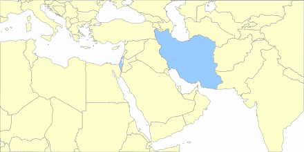
Lucky for us, lots of folks have built tools to make it easier. The Google Chart Creator is one of the better ones.  I made this map in under a minute.

Google chart map of the Middle East

What else?

It feels like I give the NYT props every day for their data viz skillz. Their stuff is pretty and awesome, but they’ve got a team of developers, designers and whiz-bang specialists.

What other tools are out there that make it simple to create embeddable news visuals, sans a staff of flash savants?

What makes a news API tasty? NYT: Gimme some sweet metadata!

Amy Gahran did a great write up on the upcoming NYT API over at E-Media Tidbits:

I think it would be great if more news organizations and journalists could learn a different approach to presenting news — one that provides structure to information that supports both conventional storytelling and remixing, analysis, or alternate representations.

JD Lasica’s take on why it’s important is spot on:

The salvation of the news industry — if there is to be one — will come not from corporate board rooms but in unleashing the pent-up power of the citizenry as part of a multipronged social media/participatory media strategy.

Let’s just hope the folks over at the Times write a good one. APIs are not guaranteed to be useful. If they quit at movie listings, they’ll have given us little. But if they coat their stories in layers of delicious metadata, the web will eat them up. (Personally, I’d prefer a Microformat for news metadata, but I’ll take what I can get.)

What do you want to know about a news story?

There are obvious useful bits: date, headline, author, location, etc., but what else would be neat? How about translated headlines? Or full translations? Related news? Related videos? Related links on other sites?

Sources!

Tags!

Target demographics!

Krishna Bharat told me after his talk at Journalism 3G that the Google News bots would love to know if a particular story was from a wire service.

What uber-mash-upable goodies would you want from the NYT?