enviroVOTE: Tune in tonight to track the environmintiness of the elections

This morning, Ryan Mark and I launched enviroVOTE!

Conceived last Monday, and built in a three-day coding sprint that ended in the wee hours this morning, the site tracks the environmental impact of the elections by comparing winning candidates with environmentally-friendly endorsements.

enviroVOTE

The numbers

Amy Gahran got the scoop with her E-Media Tidbits post:

The site’s home page features a meter bar currently set to zero. That will change as election results come in tonight. You can also view races by state, with links to specific eco-group endorsements given to specific candidates. …

But the analysis goes deeper than that. Below the meter bar is a percentage figure. That’s where Envirovote gauges the level of enviromintiness of the 2008 elections. Boyer defines enviromintiness as “The freshness of the breath of the nation. Technically, this is the percent change in the eco-friendliness of this year’s elections compared to the last applicable elections for the same seats.”

We calculate the eco-friendliness of a candidate based on how many environmental endorsements they’ve received compared to their race-mates.  Most of the endorsement data, as well as candidate and race information was lovingly sucked through the tubes from Project Vote Smart.  Other data was pulled from Wikipedia and the environmental groups’ websites.

The awesomeness to come

The enviro-meter hasn’t moved yet, but very soon it’ll show the environmental impact of today’s election.  We’ll post the results as they come in tonight, and if America made environminty choices, those bars are gonna start turning green!

So, what are you waiting for?

Check out enviroVOTE tonight, as the polls come in!  And for the play-by-play, follow us on Twitter!

Tell your story with data, without writing a line of code

I’ve been on the hunt for quick and dirty ways to show off data: visualization tools that are free, pretty, and easy to embed in a story.  Here are my finds so far.

Kick-ass embeddable visualizations

Upload your data set to ManyEyes, and you can turn it into all kinds of neat charts and wacky interactive stuff like word trees. They make it really easy to share. Click on the “share this” link below any visualization to get a snippet of HTML to paste into a story.

Amy Gahran loves word trees too:

You specify a word or phrase, and ManyEyes shows you all the different contexts in which that string appears in a tree-like branching structure. This helps reveal recurring themes in the document, and shows how topics and subtopics are related.

The other hot ManyEyes demo is the government expenses visualization. Use the menu on the left to drill down into spending categories. (Can you find the S&L bailout?)

There are so many kick-ass things you can make with ManyEyes: tree maps, tag clouds, and bubble charts, to name just a few. Here’s a map!

Timelines get sexy

It’s easy to make sweet, interactive timelines with circaVie. Like, really easy. Sign up, click “start a timeline” and add events. Like ManyEyes, they also make it simple to embed a widget, just paste in the provided snippet.

http://www.circavie.com/flash/timeline.swf
Text message scandal timeline by DFP Graphics

Words are pretty

Wordle makes pretty text visualizations by shuffling words from a file, web page, etc., and sizing the words based on how frequently they occur. Much simpler than a word tree, but sometimes simple is just what you need.

Sixth W on Wordle

Need a map, fast?

Google’s Charts API is suuuper cool.  It can make you bar charts, maps, venn diagrams, even sparklines.  But it’s a tool for web developers, so it’s a bit chewy to use if you’re not familiar with a few things.

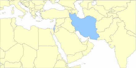
Lucky for us, lots of folks have built tools to make it easier. The Google Chart Creator is one of the better ones.  I made this map in under a minute.

Google chart map of the Middle East

What else?

It feels like I give the NYT props every day for their data viz skillz. Their stuff is pretty and awesome, but they’ve got a team of developers, designers and whiz-bang specialists.

What other tools are out there that make it simple to create embeddable news visuals, sans a staff of flash savants?

Surviving newspapers: don’t get caught in the undertow

Are we sinking or sunk?  Alfred Hermida writes that, at least in Canada, new research shows that nobody buys the paper for local news:

The main reason for choosing newspapers was out of habit. People were either daily readers or subscribers.

But only 8% said they choose newspapers because they were a source of local news. And even less said it was because they like holding a physical paper.

101_2510 by Br3nda
101_2510 by Br3nda

How to keep your head above water

Amy Gahran, Swimming Lessons for Journalists:

So where will today’s journos find tomorrow’s jobs? Here’s my take: Not in news organizations. At least, not in news orgs as we’ve grown accustomed to them over the last century. That ship is quite obviously sinking.

Mindy McAdams, The survival of journalism, 10 simple facts:

Newspapers were a nice business. Publishers could make the product insanely cheap (remember the penny press), and the advertising would cover the expenses, plus generate fantastic profits. However, this is clearly over. It’s done. It worked for a long time, but now, like trans-Atlantic leisure travel in big passenger ships, it will never work again.