Old friends! Ripoffs! Hateful comments! — A media blitz roundup

Invisible airwaves, crackle with life…

I don’t write about it much here, but I love the radio. NPR is my primary daily news source. So, I was totally geeked when Here and Now asked me to be on their program. And through the magic of editing, I think I managed to sound pretty alright!

(You know how, when someone gets under your skin, but you’re so worked up all you can say is “Oh yeah? Well, your momma!”? And then later, when the moment is gone forever, your brain catches up and comes up with all sorts of erudite, polysyllabic arguments? Radio is like that.)

Best part about the radio bit? All the old friends who emailed me after they heard the program, including one of my favorite high school English teachers. Dunno if/when the web will have that kind of reach. Love.

“…part of a hegemonic institutional perspective that is glaringly…”

Back online, my Hackers wanted! bit on O’Reilly Radar got a lot of attention, mostly hating on journalism and grumbling about needing a bachelors degree before pursuing a masters degree. But I’m hopeful that the message got through to a few programmers who want to make the world a better place.

In retrospect, I should have probably explained the importance of journalism in a democratic society, and ceded that yes, journalism is mostly broken right now, but this is our opportunity to fix it. Hindsight. Le sigh. If you’re into it, check the comment threads on the original post, and the nerdy aggregators that picked it up:

S’pose if you’re not pissing somebody off, you’re doing it wrong. Right?

Rich Gordon, the fella who decided it was a good idea to bring coders to J-school, wrote a response on Idea Lab including an interview with my new boss, Digital Editor at the Chicago Tribune, Bill Adee.

I even got ripped off completely by Tech Crunch, where fellow Medill alum Leena Rao summarized my post and completely failed to mention where she got the brilliant idea — eliciting 85 comments. Thanks for not linking!! Love!

From concept to sketch to software: Building a new way to visualize votes… mmm, environminty!

Ryan Mark and I built enviroVOTE to help people visualize the environmental impact of the 2008 elections. We designed it in two evenings and made it real in a three-and-a-half-day long bender of data crunching and code.

This is the story of that time.
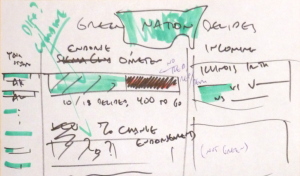
Sketch of enviroVOTE
+ coffee = enviroVOTE is real, live software

Sunday evening, 26 October: the concept

The idea struck us when Ryan and I discovered we had a common problem: homework. Ryan was on the hook to produce a story about the environment for News 21‘s election night coverage, and I needed to build an example presenting news data in some interesting way using charts and graphs. So we decided to combine our efforts and make something that would visualize environmental information about the election.

We searched for data to present, and found that it came in many shapes; like a candidate’s track record of support on environmental issues, or statistics on national parks, nuclear power and everything in-between. But the most compelling data set we found was not stats- or issue-based: endorsements made by environmental groups.

Statistics were cut because they’re only peripherally related to the races being run. It’s not particularly interesting to say something like “in states with more than five hydroelectric power sources, the democratic candidate prevailed 18% of the time.”

Only sportscasters can get away with that crap.

Why not issues, then? They’re hard to quantify. Candidate websites are frequently slippery, ambiguous things, and we found that few politicians responded to efforts that would make their positions crystal clear like Project Vote Smart’s Political Courage Test and Candid Answers’ Voters Guide to the Environment. The best data we could find were candidates’ voting records, but without understanding the nuance of each piece of legislation, it’s nearly impossible to determine if a vote was for or against the goodness of the earth. (Also, only incumbents have voting records.)

An endorsement is a true-false, unambiguous, easy to count thing. Environmental groups like the Sierra Club and the League of Conservation Voters publish their support for candidates online. Even better, the aforementioned Project Vote Smart — a volunteer group dedicated to strengthening our democracy through access to information — aggregates endorsements, and makes them readily available for current and historic races. And Vote Smart makes them available via an API, so others can mash up their data, just like we were itching to do.

Wednesday evening, 29 October: the design

A second fury of inspiration led to the design of the site. Marcel Pacatte, my instructor and head of Medill’s Chicago newsroom, was our source of journalistic wisdom. He and I identified our audience and discussed the angles and presentation methods that would best serve them. Obvious ideas like red/blue states and a map of the nation’s greenness were tossed — maps aren’t all that good at showing off numbers. (Notable exceptions include cartograms and the famous diagram of Napoleon’s march to Moscow, neither of which seemed sensible metaphors to adopt.)

Working out the enviroVOTE concepts on a whiteboard
Scope creep, be damned!

We decided to not make a voter’s guide, since there was little time before the election for folks to find the site, and to instead make something that’s interesting the day of the elections, and useful in the days following. So we looked for numbers to support that mission.

Counting environmentally-friendly victories would be both timely on election night, and purposeful later. We could calculate a win for the earth by counting endorsements: if the winning candidate had more endorsements, it was a green race. This was easy to aggregate nationally as well as by state.

And by running the same numbers on the previous races (two years ago for the House, six for the Senate, etc.) we could calculate the change in the environmental-friendliness of the nation’s elected officials, a figure that became known as “environmintiness.”

In addition, some races potentially held more impact for the environment than others — because of their location or the candidates running — so we decided it was necessary to highlight these key races alongside the numbers.
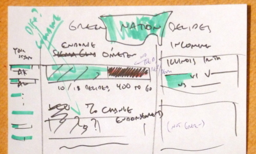
The sketch that served as the primary design document for enviroVOTE

In a whirlwind sketch-a-thon, the design for the site flew together. We would show off the two big numbers in the simplest possible way. No maps, pies or (praise the lord!) Flash necessary. They’re both just percentages. To set off one from the other, we decided on a percentage for the percent change, and a one-bar chart for the victory counts, in aggregate and for individual states.

Users would be interested in seeing results from their home state, so we made the states our primary navigation, and listed them, along with their bar chart, down the left side of the page. (We explicitly decided to not use a map for navigation, like most sites do. If I lived in Rhode Island, I’d effing hate those sites.)

Putting the big numbers front and center and listing the incoming race results down the right gave users an up-to-the-minute snapshot of the evening. The writeups about key races, though important, were our least timely information, so we made them big and bold, but placed them mostly below the fold.

We produced a simple design, just three pages — home, a state and a race — each presenting more detail as you drilled down.

Saturday and Sunday morning, 1-2 November: the development

Development began Saturday morning. We decided to build the site on Django, the free and open source web development framework that we were concurrently using to build News Mixer, the big final project of our master’s degree program. (If you’re interested in our reasons why, and how it all works, check out my post that explains the same stuff re: News Mixer.)

We brainstormed names for our new baby, and immediately checked to see if the urls were available. envirovote.us was the first one we really liked, so we bought it and started running. Ryan designed a logo and whipped up a color scheme, and thus a brand was born.

Improvising the details, we built the site very closely to as it was designed. (The initial sketches were mine, but Ryan gets the props for making it look so damn sexy.) Coding the site took about a day and a half, minus time for Ryan to go home and sleep, and for me to cook soup.

We used the awesome, free tools at Google Code to list tasks and ideas, manage our source code, and track defects. The simple concept and excellent tools helped make this a relatively issue-free development cycle. Django, FTW!

Sunday afternoon and Monday, 2-3 November: the gathering, massaging, and jamming in of data

Pretty much finished with the code, minus subsequent bug fixes and tweaks, we started on the data.

Ryan used the Project Vote Smart API to gather information on current and historical races: the states, districts, and candidates that form the backbone of our system. He wrote Python scripts to repeatedly call the API, munge the response, and aggregate all of the races, candidates, wacky political parties, and the rest into files we could then pump into the database.

I attacked from the other side and scoured environmental groups’ websites, as well as the endorsement data provided by Project Vote Smart, to collect the endorsements we use to calculate the big numbers.

Once all the data was collected into text files, we then wrote more scripts to read those files, scrub the data of inconsistencies, poor spelling, and other weirdness, and finally fill the database.

All of this took a day and a half, far longer than we had hoped, and as much time as was necessary to build the website. I did not cook soup. We ordered in.
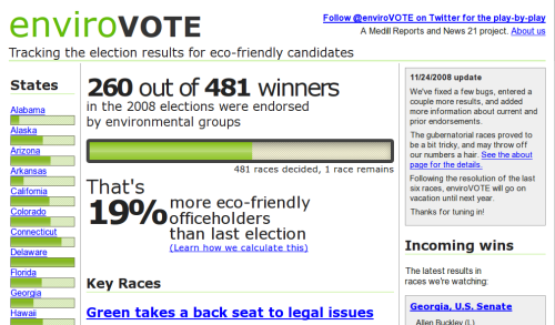
enviroVOTE is real, live software
Coffee, nerd sweat… smells like software. Yet, curiously minty-fresh.

Tuesday, 4 November

After attending class all day in Evanston, Ryan and I headed downtown for an evening of data input and cursing at screens.

Julia Dilday and Alexander Reed watched the AP wire all night, tracking races and gathering results and entering them into the system. I cannot express how much more difficult this was than we anticipated. Julia and Alex: thank you thank you thank you thank you.

Ryan kept the system humming through the night. He tamed the beast: keeping the site online, fixing bugs, and updating the administrative interface in an effort to improve the poor working conditions of Julia and Alex.

I ran the public relations effort: taking interviews, helping input incoming races, and getting the word out about our little project. I also gave enviroVOTE a voice. We set up a Twitter account to tell the nation about environmintiness as the results came in. (For a time, the site automatically twittered with each race result, until we realized that it was sending far more tweets than anyone would ever want to read, and turned it off.)

The aftermath

I’m told the presidential race was noteworthy, though I can’t recall who won — it was just one of nearly 500 races we recorded that night, and we weren’t watching the TV.

Since the 2nd, we’ve fixed a few bugs and we’ve slowly added the final race results as they’ve trickled in. The site is not nearly as dynamic as is was election night, but maybe we’ll have another few days free next year.

How we built News Mixer, part 3: our agile process

This post is last in a three-part series on News Mixer — the final project of my masters program for hacker-journalists at the Medill School of Journalism. It’s adapted (more or less verbatim) from my part of our final presentation. Visit our team blog at crunchberry.org to read the story of the project from its conception to birth, and to (soon) read our report and watch a video of our final presentation.

When you made software back in the day, first you spent the better part of year or so filling a fatty 3-ring binder with detailed specifications. Then you threw that binder over the cubicle wall to the awkward guys on the programming team.

They’d spend a year building software to the specification, and after two years, you’d have a product that no one wanted, because while you were working, the world changed. Maybe Microsoft beat you to market, or maybe Google took over. Either way, you can’t dodge the iceberg.

IMG_3605 by nautical2k

Agile software development is different. With agile, we plan less up front, and correct our course along the way. We design a little, we build a little, we test a little, and then we look up to see if we’re still on course. In practice, we worked in one-week cycles, called “iterations,” and kept a strict schedule.

How we met
Every morning, we scrum. A scrum is a five-minute meeting where everyone stands up, and tells the team what they did yesterday and what they’re going to do today.

And at the end of the work week, we all met for an hour to review the work done during the iteration, and to present it to our stakeholders, in this case, Annette Schulte at the Gazette and our instructors Rich Gordon and Jeremy Gilbert.

Design, develop, test, repeat!
In the following iteration, our consumer insights team tested what we built, our panel in Cedar Rapids. And their input contributed to upcoming designs and development.

And we managed this process with free and open-source tools. With a couple hundred bucks (hosting costs) and some elbow grease, we had version control for our code, a blog to promote ourselves (using WordPress), a task tracking system with a wiki for knowledge management, and a suite of collaboration tools – all of which are open source, or in the case of the Google tool suite, based heavily on open source software, and all free like speech and free like beer.

That’s all for now! Hungry for more on agile? Check out my posts about our agile process on the Crunchberry blog, and read Agile Software Development, Principles, Patterns, and Practices by Robert C. Martin, and The Pragmatic Programmer, by Andy Hunt and Dave Thomas, and Getting Real by the folks at 37signals.

How we built News Mixer, part 2: the trouble with Facebook Connect

This post is second in a three-part series on News Mixer — the final project of my masters program for hacker-journalists at the Medill School of Journalism. It’s adapted (more or less verbatim) from my part of our final presentation. Visit our team blog at crunchberry.org to read the story of the project from its conception to birth, and to (soon) read our report and watch a video of our final presentation.

Facebook Connect launched last week to much fanfare. Put simply, it’s a tool that gives Facebook users a way to log in to News Mixer, or any web site, without having to first set up a username and password and all the usual crap you’re forced to do when you when you want to use a web site. Just click the blue button, and you’re in.

Log in with Facebook Connect on News Mixer

Besides reducing barriers to entry, Connect lets us do some pretty neat stuff. Comments used to happen in the darkness — they were buried at the bottom of an article, where only the trolls dwell. But when you make a comment on News Mixer, your Facebook friends can see — and it’s our hope that this will bring your friends into the conversation.

More identity => less jackassery
In addition, by putting your name and face next to what you say, and showing your words to all your friends, we also hope that you’ll put a little more thought into that comment you’re writing.

But at what cost?
The thing is, we can find out a lot more about you than just your friends list. Connect reveals to us all sorts of information about our users. We could wish you happy birthday or tell you when one of your favorite bands is coming to town. Or we could help you find an apartment when you change from married to “it’s complicated.”

You see, whenever you use a Facebook Connect site, or any Facebook application for that matter, you effectively make the application your “friend.” Anything you reveal to your loved ones, we know too.

Facebook’s terms of service do tell us that we’re not allowed to store this data, but this is almost impossible for them to police. Facebook does allow users to restrict the information revealed to applications, but the reality is most people have no idea how much privacy they’re giving up with each witty remark.

But I promise, we’re being good! Other sites might be creepy, but we’re not. The only data News Mixer looks at is your name and your friend list, and we don’t store anything.

That’s it for part two! Can’t wait and hungry for more? Check out Facebook Connect in action at News Mixer!

How we built News Mixer, part 1: free and open-source software

This post is first in a three-part series on News Mixer — the final project of my masters program for hacker-journalists at the Medill School of Journalism. It’s adapted (more or less verbatim) from my part of our final presentation. Visit our team blog at crunchberry.org to read the story of the project from its conception to birth, and to (soon) read our report and watch a video of our final presentation.

We could not have built News Mixer without free and open-source software. For those of you who aren’t familiar with the term, this is how the Free Software Foundation describes it:

“Free software” is a matter of liberty, not price. To understand the concept, you should think of “free” as in “free speech,” not as in “free beer.”

Free software is a matter of the users’ freedom to run, copy, distribute, study, change and improve the software.

The Free Software Definition, Free Software Foundation

Now, journalists in the room might be surprised to hear a nerd talking like this, but the truth is that we’re remarkably similar, journalists and technologists — free software and free speech are the backbone of the web. The Internet runs on free software — from the data center to your desktop.

LAMP =
Linux (operating system) +
Apache (web server) +
MySQL (database) +
Python (teh codez)

I won’t dwell too long on the super-nerdy stuff, but for those interested, News Mixer runs on a LAMP stack, sort of the standard for developing in the open-source ecosystem. Notably missing from the list are non-free technologies you may have heard of like Java, or Microsoft and .NET.

The biggest tech choice we made was to use Django. Its a free and open-source web development framework put together by some very clever folks at The Lawrence Journal-World. For those of you in the know, it’s a framework similar to ASP.NET or the very popular Ruby on Rails, but with a bevy of journalism-friendly features. Django is how we built real, live software so freakin’ fast.

And you can have your very own News Mixer, gratis, right now, because News Mixer is also free and open source. We’ve released our source code under the Gnu General Public License, and it’s available for download right now on Google Code. So, please, stand on our shoulders! We’re all hoping that folks will take what we’ve done, and run with it.

That’s it for part one! Can’t wait and hungry for more? Check out the Crunchberry blog, or my other posts on using free and open source software to practice journalism.